Churches
Why Your Church Website Needs a Clear Next Step
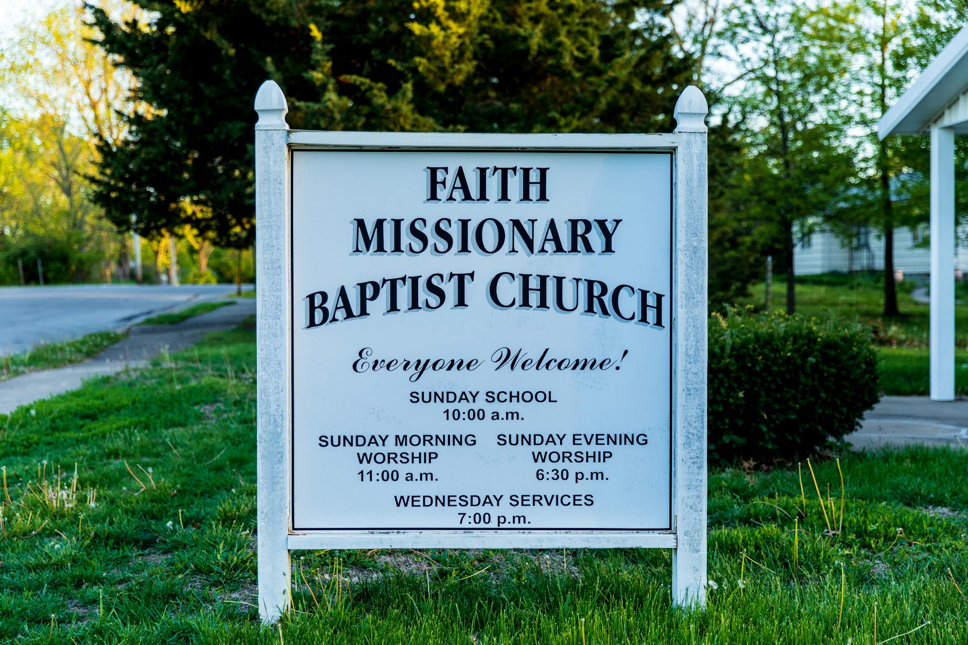
Photo by Stephen Fuller on Pexels
The Visitor Who Leaves Without Knowing What To Do
Someone finds your church website. They like what they read. They think your community might be a good fit. Then they leave—and never come back—because they had no clear idea what the next step was.
This happens more often than you'd think. A beautiful website that explains your mission, your beliefs, and your history is wonderful. But if a visitor can't easily figure out how to attend a service, join a group, or talk to someone, you've missed the moment.
What a "Next Step" Actually Means
A next step is a single, obvious action you want a visitor to take right now. It's not a menu. It's not five options. It's one clear thing.
For a church, this might be:
- "Find our service times and address"
- "Sign up for our weekly email"
- "Join our newcomer lunch this Sunday"
- "Text us a prayer request"
- "Talk to someone about joining a small group"
The best next steps are the ones that actually move someone closer to belonging, not just closer to your website.
Where to Put It (And How to Make It Obvious)
Your next step should live in three places:
On your homepage. High up, in a button or box that stands out visually. Use simple words: "Join Us Sunday" or "Get Our Service Times." Not "Learn More"—that's vague.
On your About or Welcome page. After someone reads who you are, tell them the easiest way to experience that in person.
At the end of every page. No matter where someone is on your site, they should always see a way to take that one next step.
The Mistake Most Churches Make
Trying to do too much at once. Your homepage offers a button to attend, a form to join a group, a link to give, a prayer request form, and a newsletter signup. Now the visitor is confused about which one matters most.
You're not losing anything by picking one primary next step. People who want to give will find the giving page. People interested in groups will look for that. But the person visiting your site for the first time needs a single, clear path forward.
Make It Match Your Goal
Different churches have different priorities. Some want to grow their Sunday attendance. Others are focused on small groups. Some want to build their email list so they can stay in touch with interested people over time.
Your next step should match your real goal—not the goal you think sounds nice. If you actually want people at Sunday service, don't bury that under five other options. If you're building community through small groups, make that the obvious move.
Test It Yourself
Visit your website right now as if you were a complete stranger. Can you find out when you meet? Can you figure out where you're located? Is there a person you could contact with a question? If you have to think or hunt, your visitors will too—and most won't bother.
The goal isn't a perfect website. It's a website that actually helps people take the next step toward your community.
If you're building or redesigning your church website and want a platform that keeps things simple and lets you focus on clarity instead of managing technical details, you can start free at CE Sites. We build websites for churches that are secure, fast, and easy to keep up to date—so you can spend your time on what matters instead of wrestling with maintenance.